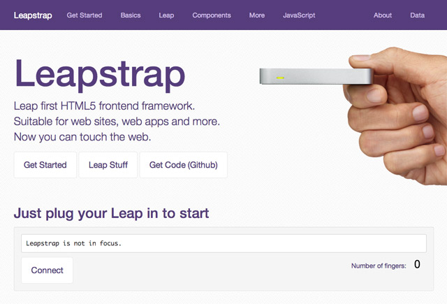
Getting started
An overview, how to download and use Leapstrap, current roadmap, basic examples, and more.
An overview, how to download and use Leapstrap, current roadmap, basic examples, and more.
Get a Leap Motion Controller
Leapstrap is a complete toolkit for building a Leap web site or web application. You can build your project fresh on top of Leapstrap or you can integrate Leapstrap into an existing project. If you've already got Bootstrap 3, or if you've already got an existing project to "add" Leapstrap too, see further below.
Leapstrap requires just 1 CSS file, 2 plugin files (jQuery and LeapJS) and the Leapstrap JS file - in the below example, Leapstrap detects all anchor (e.g. hyperlinks) and makes them leap-interactive. We don't typically recommend this for performance reasons, but hopefully you'll be able to use your Leap to "touch" all hyperlinks.
Here is some example code with our CDN links, which you may reuse. You'll get faster performance if you download Leapstrap (by zip or Github).
Put this in your <head> section:
<!-- Include Leapstrap CSS -->
<link rel="stylesheet" href="//wilkesalex.github.io/leapstrap/dist/css/leapstrap.css" />
<!-- Include jQuery (maybe you already do?) -->
<script src="//ajax.googleapis.com/ajax/libs/jquery/1.10.2/jquery.min.js" ></script>
<!-- Include Leap (maybe you already do?) -->
<script src="//js.leapmotion.com/0.3.0-beta3/leap.js"></script>
<!-- Include Leapstrap JS -->
<script src="//wilkesalex.github.io/leapstrap/dist/js/leapstrap.js"></script>
Put this before your closing </body> tag
<!-- Init Leap, Set all "a" interactive, use 1 Leap cursor/finger -->
<script>LeapManager.init({interactiveSelector:"a",maxCursors:1});</script>
Developers experienced with the Bootstrap build process can use the leapstrap-builder. Navigate to the leapstrap-builder directory using a terminal. You'll need git, npm and grunt installed. Leapstrap @ Github.
Leapstrap is currently based on Bootstrap 3.0.0. To use Leapstrap with Bootstrap, you just need to replace:
You need to link to the leap.js javascript
<script src="//js.leapmotion.com/0.3.0-beta3/leap.js"></script>
You need to add the Leapstrap initialiser
<script>LeapManager.init({interactiveSelector:"a",maxCursors:1});</script>
This presumes that you have not modified the core Bootstrap css or javascript files and that you extended bootstrap, rather than modifying it.
Within the download you'll find the following directories and files, logically grouping common resources and providing both compiled and minified variations.
Once downloaded, unzip the compressed folder to see the structure of (the compiled) Leapstrap. You'll see something like this:
bootstrap/
├── css/
│   ├── leapstrap.css
│   ├── leapstrap.min.css
│   ├── leapstrap-theme.css
│   └── leapstrap-theme.min.css
├── js/
│   ├── leapstrap.js
│   └── leapstrap.min.js
└── fonts/
    ├── glyphicons-halflings-regular.eot
    ├── glyphicons-halflings-regular.svg
    ├── glyphicons-halflings-regular.ttf
    └── glyphicons-halflings-regular.woff
This is the most basic form of Leapstrap: precompiled files for quick drop-in usage in nearly any web project. We provide compiled CSS and JS (bootstrap.*), as well as compiled and minified CSS and JS (bootstrap.min.*). Fonts from Glyphicons are included, as is the optional Leapstrap theme.
Please note that all JavaScript plugins require jQuery to be included, as shown in the starter template.
Download the Leapstrap files and start with this basic HTML template, or modify the example.
<!DOCTYPE html>
<html>
  <head>
    <title>Leapstrap 101 Template</title>
    <meta name="viewport" content="width=device-width, initial-scale=1.0">
    <!-- Leapstrap -->
    <link href="css/leapstrap.css" rel="stylesheet" media="screen">
    <!-- jQuery (necessary for Leapstrap's JavaScript plugins) -->
    <script src="https://code.jquery.com/jquery.js"></script>
    <!-- Leap (http://js.leapmotion.com/) -->
	<script src="//js.leapmotion.com/0.3.0-beta3/leap.js"></script>
    <!-- Leapstrap -->
    <script src="js/leapstrap.js"></script>
  </head>
  <body>
    <h1>Hello, world!</h1>
    <a class="leap-interactive" href="#">Click me with Leap!</a>

    <script>LeapManager.init({interactiveSelector:"a",maxCursors:1});</script>
  </body>
</html>
Build on the basic template above with Leapstrap's example template.
Nothing but the basics
Present a simple Leap-based online catalog or brochure
Leapstrap is built to work best in the latest desktop and TV browsers, meaning older browsers might just not work.
Specifically, we support the latest versions of the following:
Unofficially, Leapstrap should look and behave well enough in Chromium and Chrome for Linux, Firefox for Linux, and Internet Explorer 7, though they are not officially supported.
Internet Explorer 8 and 9 are also supported, however, please be aware that some CSS3 properties and HTML5 elements are not fully supported by these browsers. In addition, Internet Explorer 8 requires the use of Respond.js to enable media query support.
Using Respond.js with CSS hosted on a different (sub)domain (for example, on a CDN) requires some additional setup. See the Respond.js docs for details.
file://Due to browser security rules, Respond.js doesn't work with pages viewed via the file:// protocol (like when opening a local HTML file). To test responsive features in IE8, view your pages over HTTP(S). See the Respond.js docs for details.
Visit Can I use... for details on browser support of CSS3 and HTML5 features.
Leapstrap is not supported in the old Internet Explorer compatibility modes. To be sure you're using the latest rendering mode for IE, consider including the appropriate <meta> tag in your pages:
<meta http-equiv="X-UA-Compatible" content="IE=edge">
This tag is included in all docs pages and examples to ensure the best rendering possible in each supported version of Internet Explorer.
Internet Explorer 10 doesn't differentiate device width from viewport width, and thus doesn't properly apply the media queries in Leapstrap's CSS. We also need to cater for Windows Phone 8 devices that show a mostly desktop view instead of narrow "phone" view. To address this, include the following CSS and JavaScript to work around the bug.
@-webkit-viewport   { width: device-width; }
@-moz-viewport      { width: device-width; }
@-ms-viewport       { width: device-width; }
@-o-viewport        { width: device-width; }
@viewport           { width: device-width; }
if (navigator.userAgent.match(/IEMobile\/10\.0/)) {
  var msViewportStyle = document.createElement("style")
  msViewportStyle.appendChild(
    document.createTextNode(
      "@-ms-viewport{width:auto!important}"
    )
  )
  document.getElementsByTagName("head")[0].appendChild(msViewportStyle)
}
For more information and usage guidelines, read Windows Phone 8 and Device-Width.
As a heads up, we include this in the Leapstrap docs as an example.
As of Safari v6.1 for OS X and Safari for iOS v7.0.1, Safari's rendering engine has some trouble with the number of decimal places used in our .col-*-1 grid classes. We can't do much here (see #9282) but you do have some options:
.pull-right to your last grid column to get the hard-right alignmentPage zooming inevitably presents rendering artifacts in some components, both in Leapstrap and the rest of the web. Depending on the issue, we may be able to fix it (search first and then open an issue if need be). However, we tend to ignore these as they often have no direct solution other than "workarounds".
If your navigation contains many links and comes before the main content in the DOM, add a Skip to main content link immediately after your opening <body> tag. (read why)
<a href="#content" class="sr-only">Skip to main content</a>
Learn more at HTML CodeSniffer and Penn State's AccessAbility.
Leapstrap is best maintained when you treat it as a separate and independently-versioned dependency in your development environment. Doing this makes upgrading Leapstrap easier in the future.
Once you've downloaded and included Leapstrap's styles and scripts, you can customize its components. Just create a new stylesheet (LESS, if you like, or just plain CSS) to house your customizations.
Not all touch websites need to make use of everything Leapstrap has to offer, especially in production environments where optimizing bandwidth is an issue. We encourage you to remove whatever is unused in terms of LESS (CSS) and Javascript. You can do this by utilising the Github project.
We're working on a customizer - if you want to help make that, join the Leapstrap team!
Please see our About Leapstrap page.